

In today's data-driven world, the ability to turn raw data into actionable insights is a valuable skill. Looker Studio is a powerful tool that allows you to do just that. Whether you're a marketer, business owner or data enthusiast, Looker Studio can help you visualise and share data in a meaningful way.
In this beginner's guide, we'll walk you through the process of creating a basic report using Looker Studio, and we'll explore some advanced report features and tips along the way.
What is Looker Studio?
Looker Studio is a free business intelligence and data visualisation tool provided by Google. It's designed to make it easy for users to connect to various data sources, create interactive reports and dashboards, and share these reports with others.
Getting Started
Before you dive into creating your first report, you'll need a few things:
- Google Account: You'll need a Google account to access Looker Studio. If you don't have one, you can sign up for free.
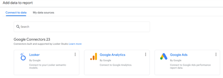
- Data Sources: Decide what data you want to include in your report. Looker Studio can connect to various sources, such as Google Analytics, Google Sheets, Google Ads, Search Ads 360, HubSpot, SEMRush and more.
For this tutorial, let's use Google Analytics as our data source.
Building Your Basic Report with Google Analytics Data
Step 1: Access Looker Studio
- Go to Looker Studio and sign in with your Google account.
Step 2: Create a New Report
- Click the "Start a new report" button.
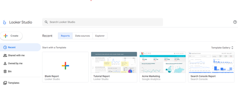
- You'll be prompted to select a data source. Choose "Google Analytics" and select the Google Analytics property and view you want to use.
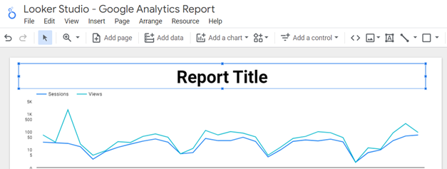
- Rename the report in the top right corner.
Step 3: Adding Data to Your Report
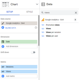
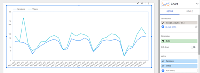
- Once your Google Analytics data source is connected, you'll see the Looker Studio canvas. On the right-hand side, you'll find the "Data" panel.
- Drag and drop the Google Analytics metrics and dimensions you want to include in your report onto the canvas. For our basic report, let's use "Sessions" and "Views."
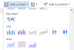
Step 4: Creating Visualisations
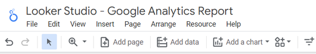
- Next, click on the "Add data" button in the toolbar.
- Choose the type of chart you want to create. For our example, let's select "Line chart" to visualise the trend of sessions and views over time.
- Configure the chart by selecting the appropriate dimensions and metrics. For example, use the "Date" dimension for the X-axis and "Sessions" and "Views" for the Y-axis.
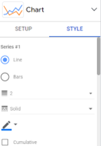
Step 5: Customizing Your Report
- You can customize your chart by adjusting its style, colours, and labels. Simply click on the chart and use the options in the "Style" tab on the right.
- To add a title to your report, click the "Text" option in the toolbar and add a title text box.
Step 6: Save and Share Your Report
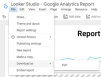
- Click the "File" menu and select "Download as" and select “PDF” to save your report offline.
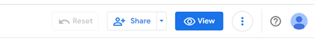
- To share your report, click the "Share" button in the top-right corner. You can generate a shareable link or invite collaborators.
Exploring Data Connectors
Looker Studio offers a wide range of data connectors that allow you to connect to various data sources, making your reports more comprehensive and insightful. Here are some of the available connectors:
- Google Analytics: Connect to your website or app data to track user behaviour and performance metrics.
- Google Ads: Analyse your advertising campaigns by connecting to your Google Ads account.
- Google Sheets: Easily import data from Google Sheets, ideal for manual data entry or custom datasets.
- Google BigQuery: For large-scale data analysis, connect to Google BigQuery to handle massive datasets.
- SQL Databases: Connect to various SQL databases, including MySQL, PostgreSQL, and more, to access and analyse structured data.
- File Upload: Upload CSV or Excel files directly into Looker Studio to work with your own datasets.
These connectors make it possible to create comprehensive reports by combining data from multiple sources into one report, providing a holistic view of your business or project's performance.
Exploring Different Types of Charts
Here are some common types of charts and when to use them:
- Line Chart: Use this chart to show trends over time, such as the trend of sessions and views over months or years.
- Bar Chart: Compare data across categories, like comparing sessions by traffic source.
- Pie Chart: Show the composition of data parts within a whole, such as the percentage of sessions from different devices.
- Area Chart: Similar to a line chart but with the area under the line filled, useful for displaying cumulative data trends.
- Scatter Plot: Use this to visualise the relationship between two metrics, such as sessions and pageviews.
- Table: Display detailed data in a tabular format for easy reference.
- Heat Map: Use a heat map to display data values using colours. Heat maps are great for visualizing patterns in data, such as user engagement on a website based on time and day of the week.
Advanced Report Features and Tips
Now that you've mastered the basics, here are some advanced report tricks and tips to take your Looker Studio skills to the next level:
Use Calculated Fields
Looker Studio allows you to create calculated fields, which are custom metrics or dimensions based on your existing data. For example, you can calculate conversion rates, ROI, or apply custom formulas to your data.
Apply Filters and Date Ranges
Implement filters and date ranges in your reports to allow users to interactively explore data. This is especially useful for larger datasets, enabling viewers to focus on specific time periods or segments.
Blend Data Sources
Combine data from multiple sources into a single report. For instance, merge Google Analytics data with Google Ads data to gain a more comprehensive view of your online marketing efforts.
Explore Community Visualisations
Looker Studio offers community visualisations created by other users. These custom chart types and widgets can add unique elements to your reports. You can find them in the "Community visualisations" section when adding a chart.
Schedule Automatic Data Refresh
Set up automatic data refresh schedules to ensure your reports always display the latest data. This is essential for real-time reporting and analysis. 6. Master Looker Studio Functions Learn about Looker Studio functions to manipulate and transform your data further. Functions can be used in calculated fields to perform advanced calculations.
Congratulations!
You've not only created your first basic report using Looker Studio but also gained insights into advanced report features and tips. Looker Studio is a versatile tool that empowers you to communicate your data effectively and make informed decisions. Start with the basics, and as you become more comfortable, explore these advanced features to create reports that provide even deeper insights for your business or projects. Data visualisation is a key aspect of data-driven decision-making, and with Looker Studio, you have a powerful ally in your data analysis journey. Happy reporting!
If you'd like help setting up your Looker Studio reports, we'd be happy to help! Just get in touch now.
Newsletter sign up
Post Information
| Author | Kavish Harillal |
| Channel | Analytics |